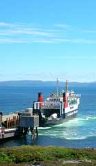
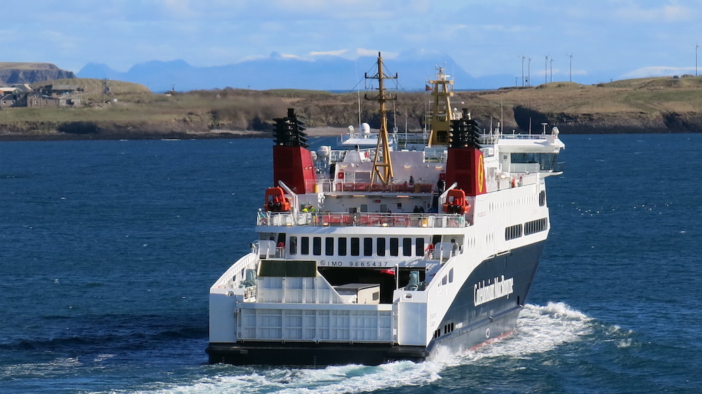
Is a stern view inherently less attractive or interesting than a bow view? Hebrides at Uig on 2 March 2018. Copyright CRSC
Colin Tucker throws the spotlight on an under-appreciated aspect of ship photography.
I thought I had finished with stern lectures when I ended my career in teaching. But then I realised there was still one to be completed – a lecture on the sterns of MacBrayne and CalMac steamers and ferries. When we picture one of these vessels we normally see the image of her coming towards us, showing a bow wave beneath a shapely (or otherwise) bow.
So when would we see the other end of the vessel? Without a doubt when driving on to a ferry at Oban or Ullapool, the ship tied up with bow facing outwards, ready to whisk us off to some near or far Hebridean island. Or perhaps we were held up in traffic and arrived late for the ferry, only to see her disappearing across the firth or down the loch, showing us a spreading wake behind her stern. I also found it interesting that there are far more photographs of ships taken bow-on, rather than stern views. A quick count through several books of MacBrayne pictures provided clear evidence of this fact.
Have all of these been represented on MacBrayne ships?
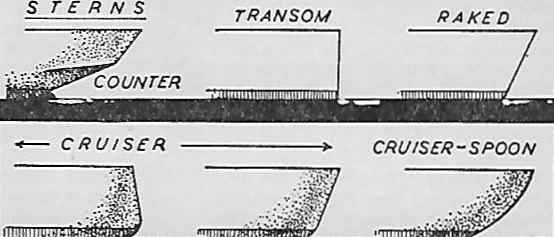
My Observer’s Book of Ships, now over 60 years old, describes six types of stern pic stern diagram – counter, transom, raked, cruiser (two types, sloping in and out) and cruiser-spoon. Have all of these been represented on MacBrayne ships? Were there any standard patterns? Were any ships built with other shapes of stern? These are all questions to be answered.
In the 19th century almost all of the ships had counter sterns, but there was considerable variation in their designs. Possibly the most graceful looking were those on ships which had an open deck at the stern, such as Fusilier and Grenadier.
Viewed from the side, the stern of Columba would appear to be the same, but rather than being a rounded shape, hers was more of a square shape with rounded corners. It might be assumed that the graceful hulls of Clansman and Claymore would be equally graceful, but having the vertical railings of the deck round the stern seems to give them a more functional shape. What all these vessels did have on their sterns was the gold scrolling that accompanied their name and port of registry.
‘A square shape with rounded corners’: stern view of the 1878 Columba. Copyright CRSC Archive Collection
A less elegant but more functional shape of counter stern could be seen on Cavalier and Handa. Both these ships had been designed to fit canal locks, those on the Caledonian Canal in the case of the former, the Crinan Canal in the latter. It may be because of this requirement that the stern appears to be more blunt, with the top strake leaning forwards rather than continuing gracefully stern-wards.
The one exception to the counter stern was Linnet. She would appear to have had some sort of cruiser stern, although it is difficult to see as her superstructure came vertically down almost to the waterline. Possibly there was a hidden counter beneath.
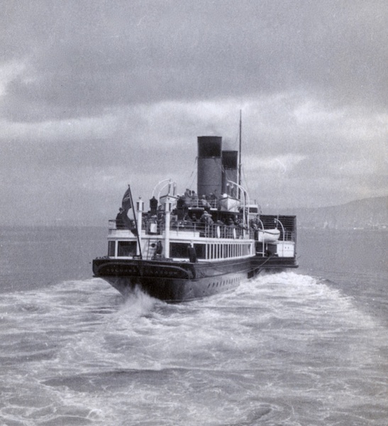
The use of the counter stern continued into the 20th century. From the smallest to the largest, Comet to Chieftain, each had the traditional sloping stern in one form or another. The first significant change came in 1929 with the arrival of the new vessels promised under the 1928 mail contract. Lochness presented a totally new profile, described at the time as a ‘miniature liner’. This profile included a stern not previously seen on a MacBrayne ship. Gone was the graceful counter, replaced by a cruiser stern which must have looked very modern and utilitarian to eyes used to gracefulness on a ship.
She was the first of eight traditional mail boats to be built with that type of stern, which by the 1950s could be looked upon as the new ‘traditional’ MacBrayne stern. The last of these was Claymore. After she was sold to Greece to become City of Hydra she was rebuilt to sport a smart cruiser-spoon stern with an almost pointed shape – quite a change.
Other ships to join the fleet during those years had different sterns. First to arrive was Lochshiel of 1929. This small cargo ship carried a cruiser-spoon stern, much more rounded than the cruiser. This may have been the preferred design of her builders, Henry Robb Ltd of Leith.
‘Gone was the graceful counter, replaced by a cruiser stern which must have looked very modern and utilitarian to eyes used to gracefulness on a ship’: the 1929 Lochness at Oban. Copyright CRSC
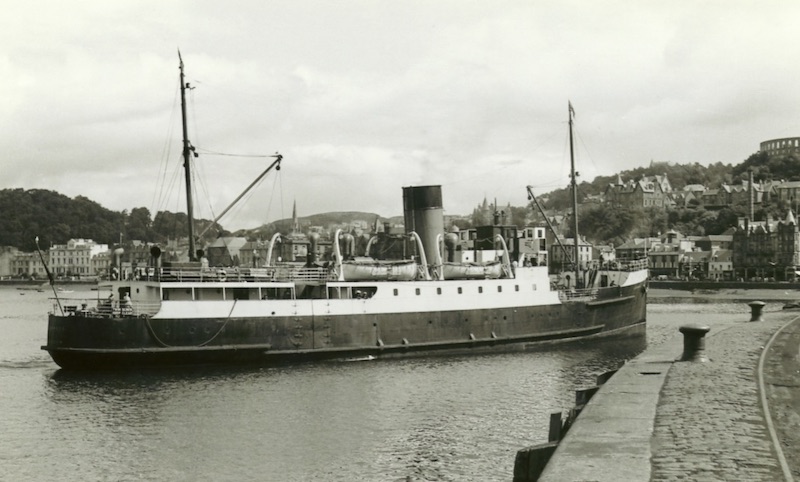
The counter stern appeared again on 10 ships large and small. These were all second-hand purchases dating from as far back as 1871, when Lochbroom had been built as City of London for the Aberdeen Steam Navigation Co, and also included the two turbine steamers which became Saint Columba and King George V.
The post-war years saw the arrival of modern cargo vessels: all had cruiser sterns, varying from the almost vertical one of Loch Frisa to the forward sloping stern of Lochdunvegan. Theirs may have been different due to their being second-hand purchases rather than designed for MacBraynes.
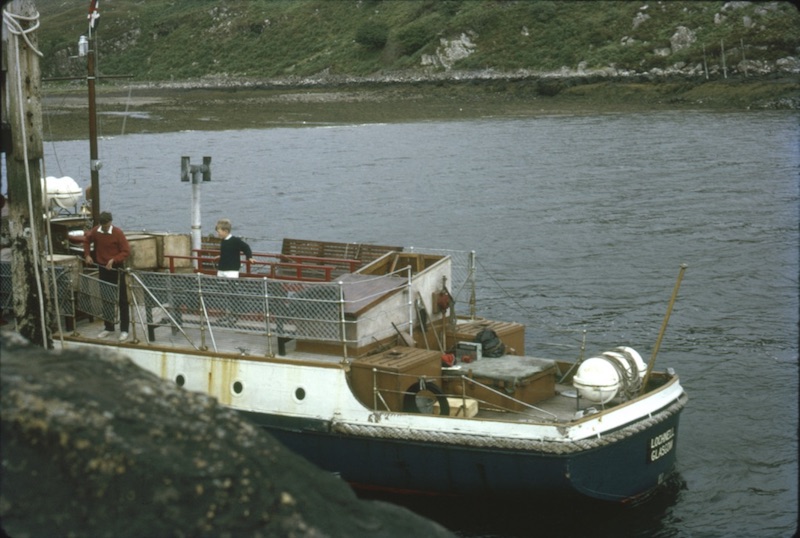
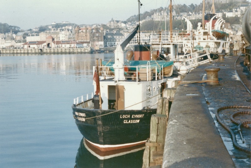
David MacBrayne Ltd acquired a number of small vessels over the years and they brought further variation to the stern types. The two vessels named Lochbuie had square-cut transom sterns, as did Lochnell and Applecross. On a slightly larger scale Loch Arkaig had a neat little transom, while Loch Eynort and Loch Toscaig were built with what might be described as a canoe stern, the two aft sides curving round to meet at a pointed stern post.
The arrival of car ferries led to a whole new series of stern types. Not with the first three ferries, which had normal cruiser sterns, until Clansman was extended in 1972-3 and appeared with a slightly flattened stern with its vehicle ramp. Looking back over the past 50 years or so, there have been four main types of stern.
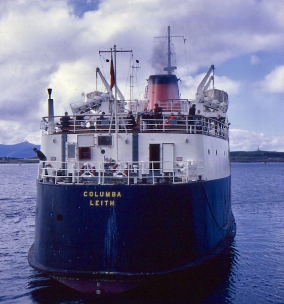
Stern view of the 1964 Columba
Of the second generation of ferries with enclosed car decks, Isle of Mull, Caledonian Isles and Isle of Lewis were all built with box-like hulls which do not taper towards the stern. The three ships have the same shape of square, vertical stern with rounded corners, but there are variations among the three. Isle of Mull has four lines of belting: is this because she has to berth many times each day? The stern of Caledonian Isles is the same but she only has two lines of belting. Isle of Lewis, largest and widest of the three, has two lines of belting, but can be recognised by her vehicle ramp, which is offset to port.
Suilven had a more pleasing shape of stern, in keeping with her attractive overall profile: the hull tapered slightly towards the stern, which was slanted in towards the waterline.
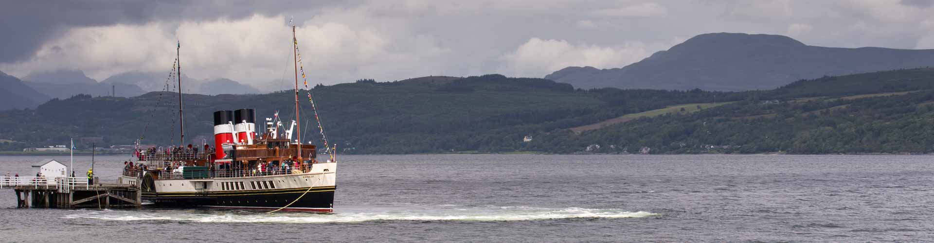
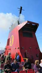
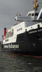
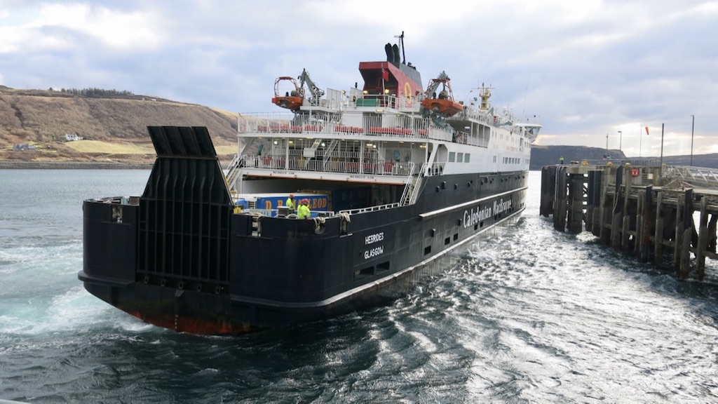
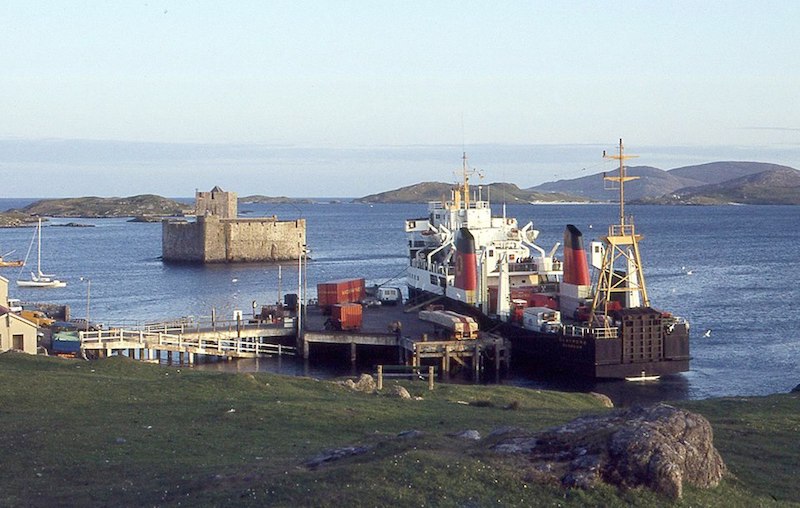
By their very nature large open-ended ferries have a distinctive design of stern. All are similar, but again slight modifications were made through the years. The earlier ships, such as Pioneer, had a lower deck-line and more of a curve to the hull than newer ferries such as Hebrides and Finlaggan. The sterns of Pioneer and Claymore were both spoilt by the ugly mast constructions positioned just ahead of their vehicle ramps.
The exception to this is Loch Seaforth. Hers is not a good-looking stern. Bigger and wider than the other ships, it is a very boxy shape, not helped by sharp corners, the sloping side and parallel painting. Below the bottom of the ramp the hull protrudes, looking almost like a diving platform on a yacht. The ramp is the full width of the stern and of uneven shape which does nothing to enhance the ship’s appearance when viewed from the stern. When travelling at speed, with a good wash from the propellers she can take on the appearance of an old Mississippi stern-wheeler.
Loch Seaforth: ‘Hers is not a good-looking stern, but when travelling at speed, with a good wash from the propellers she can take on the appearance of an old Mississippi stern-wheeler’. Copyright CRSC
The smaller ferries can be divided clearly into two designs. The original small ‘Island’ class ships, built on the landing craft formula, had a proper stern, although these did not often appear in photos as they always berthed bow in. When they could be seen, however, the sterns of these vessels were tidy transoms.
The double ended ferries are like those little hairy terrier dogs, difficult to tell which is the front and which is the rear. The ferries are never symmetrical, however, and therefore do have one end which is the stern. Whichever end it is, it is angular and not enhanced by the folds of the vehicle ramp. Loch Buie is the only one where stern can be distinguished from bow — but by superstructure not hull shape. The larger Loch Portain and Coruisk are more like ‘real’ ships, and have more recognisable sterns to suit their stature.
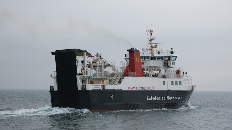
One ship which cannot be said to have a good-looking stern is Lochnevis. On this ferry practicality has clearly taken precedence over aesthetics. What might have been a pleasing transom stern has been spoilt by the provision of a vehicle ramp out of proportion to the rest of the ship — so large that it has to be supported on unsightly steelwork. I’m sure these thoughts would never enter the minds of the good people of the Small Isles when Lochnevis has fought her way through stormy seas to link them with the mainland.
Finally, what about the new Glen Sannox? I have trawled through many internet images of her on Ferguson’s slipway and at the fitting out berth – and not one proper photo of her stern!
Square-cut transom stern: Lochnell at Applecross in September 1966. Copyright CRSC Archive Collection
A canoe stern, the two aft sides curving round to meet at a pointed stern post: Loch Eynort at Oban on 18 October 1969, with Claymore behind. Copyright Lawrence Macduff
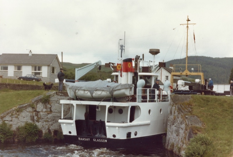
The tidy transom of Raasay is well profiled at Cairnbaan on 2 July 1981. Copyright Lawrence Macduff
A beautiful view of Claymore at Castlebay pier in June 1983: her stern was ‘spoilt by the ugly mast construction positioned just ahead of the vehicle ramp.’ Copyright Linda Gowans
Four lines of belting: stern view of Isle of Mull at Oban on 23 August 2016. Copyright CRSC
Two lines of belting: Isle of Lewis arriving at Barra on 17 August 2015. Copyright John Macdougall
Can any aesthetic quality be recognised in the stern of Lochnevis?
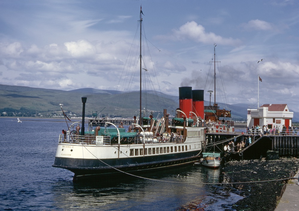
Most beautiful of all? King George V’s elegant counter stern is well profiled at Fort William in July 1971. Copyright CRSC Dr Joe McKendrick Collection
More by Colin Tucker:
The future of the Outer Hebrides, 40 years ago
Lochs and Lochs, or ‘sailing in home waters’
Crossing the Minch — Variations on a Theme
Colin Tucker’s widely admired book Steamers to Stornoway is available in the CRSC Shop.
All photos on this website are copyrighted by their respective owners. All rights reserved. Unauthorised use is prohibited.
Published on 7 April 2018